
Many people have asked about how we do the illustrations for the Prezi presentations I build, so I thought I’d write a little about the process we go through. I say “we” because the presentations are mine, but I couldn’t do them without the help of an incredibly talented illustrator, Mat Moore.
We’ve worked together on illustrating books and presentations for three years now, and I’m pretty sure that Mat can now read my mind. Our process now goes something like this.
I call Mat and say “I need a new illustration, as detailed as possible (translation: I’m paying top dollar – make it awesome!), on the Future of Working. Because a lot of what I’m talking about will be related to digital and virtual work, it would be cool if the illustration was a corporate office park, but built entirely out of computer chips – remember we started doing an illustration like that once? Well, let’s really go all out this time.” Mat: “Okay.”

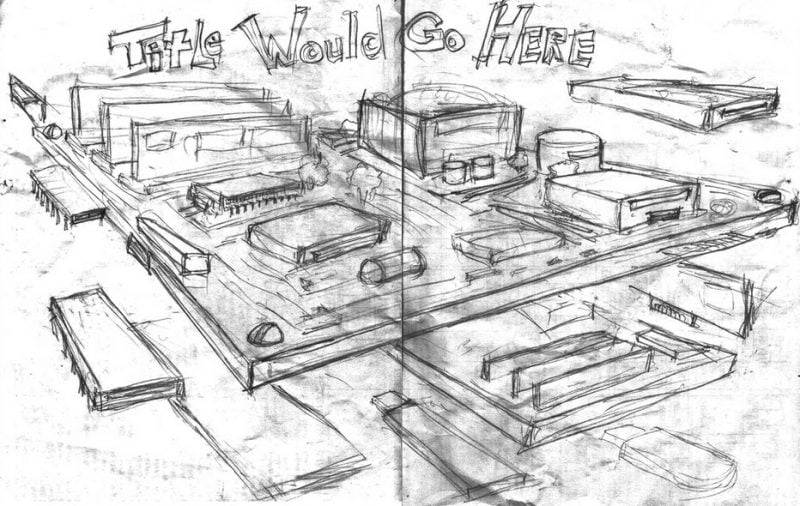
First (Rough) Draft of “Future of Working” Click on Image to Enlarge.
At some point a few days later, I get a draft. It is a ROUGH of what the sketch might look like. Just like with software design, it’s really better to make changes here, before the really hard work of illustration is done. This is the point where you have to tell the illustrator if you hate it, want specific details, etc. Sometimes I know that I want some very specific elements in the presentation (for example, in past presentations, I’ve asked for a money tree, a person straddling the “Internet” pipes holding a laptop, etc.). This is the time to tell your illustrator about anything specific that you really NEED to be in that illustration. It will be much harder to add it later.
At this point in our working relationship, Mat knows that he needs to leave me blank spaces, roughly rectangular in shape, to add the presentation elements. We didn’t know this when we first started doing these presentations, it has been a feature that has evolved over time. If you look carefully, you’ll see that every illustration has space specifically left for this purpose now. When I get next version of the illustration from Mat, there is still a little back and forth between us as we tweak the illustration.
Once I’m on the final version, I have to produce a SWF file for the illustration (the PDF versions are usually too big to be processed by Prezi). Then I look for the blank canvases that Mat has left me in the illustration. Here are a few examples of places where I will drop the “slides” in this presentation.
Nice rectangular spaces on this computer chip. Perfect for a sequence of slides on the same topic. Click on image to enlarge.

Here’s an example of some less structured space that was left blank for me to add presentation elements. You can see the “before” and “after” in the comparison. Click on the image to enlarge.

Here you can see the same illustrated space without and then with the presentation elements. Click on image to enlarge.
In the final version, the presentation elements are so integrated with the image, that it can actually be difficult to spot them. The only real indicators are because the presentation elements introduce an element of color to the black & white canvas.

Final “Future of Working” Prezi. Click on image to enlarge.
You can view the final version of this particular illustration here: Future of Working or click through the embedded version below.

