I am really getting fed up tired of having to explain Wolfram Alpha graphs to students. For some reason, the default in Wolfram Alpha is to graph everything with imaginary numbers. This results in bizarre-looking graphs and makes it near-impossible to use Wolfram Alpha as a teaching tool for undergraduate mathematics, a real shame. Now that Google has entered the online graphing fray, I have a wary hope that the programmers at Wolfram Alpha might finally (after two years of waiting) fix the problem.
Here are a few examples. I’ll show you the graph in Wolfram Alpha, on a TI-84 Plus emulator (TI-SmartView), from Google Search, and from Desmos Graphing Calculator. These are all the “default” looks. Wolfram Alpha consistently shows this confusing imaginary view as the default whenever working with graphs involving variables in radicals.
Example 1:
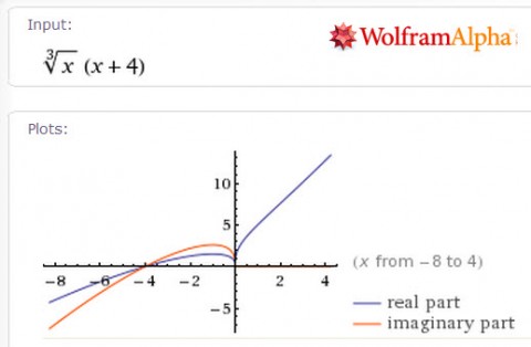

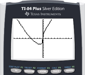
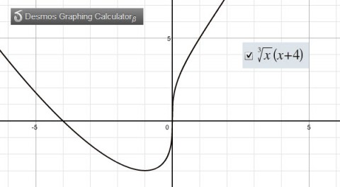
Example 2:
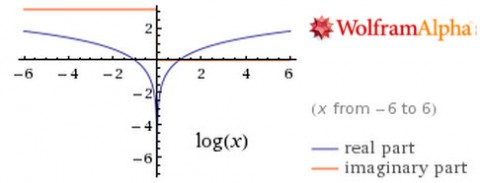

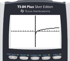
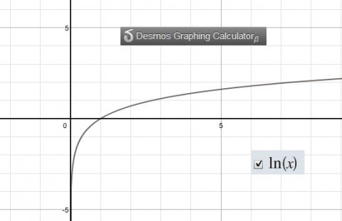
Example 3:
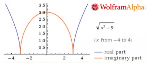
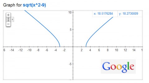

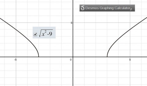
I was hoping to really teach my College Algebra students to use Wolfram Alpha next semester. But, between the Logarithm Issues and this graphing issue, I’m afraid I’m going to have to abandon ship on using Wolfram Alpha as a teaching tool for students. Students simply don’t have enough mathematical sophistication to look at the graphs and realize that they aren’t seeing what they are supposed to be seeing and I’m seeing far too much confusion on assessments that are caused by the oddities in graphs and logarithms on Wolfram Alpha. What a shame that we can’t work this out, huh?


