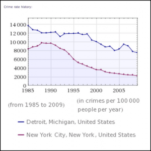
The single most important tool I’ve found for improving Digital Literacy is Wolfram Alpha. At your fingertips, whether on your phone, tablet, or laptop, you have access to all the world’s readily available data. All you have to do is ask. The best thing I can do to improve data literacy is to teach students (and other adults I know) to question the facts they are being quoted as gospel. Here are a bunch of searches I’ve done recently to verify or refute data someone has told me in conversation.
- Salary for a doctor
- Unemployment in Utah
- Federal deficit
- Calories in a Frappacino vs a Latte
- Crime rate in New York vs Detroit
- Facebook Report (to generate a report of all your Facebook data)
- Gapminder (the software used by Hans Rosling in his many, many TED Talks)
- Worldmapper (territories are scaled/resized according to the subject of interest)
- Measure of America (look at interactive maps and data about Social Science in the U.S.)
- Human Development Reports (explore public data from the United Nations using a variety of visualizations)
- Visual.ly (create your own infographic around a set of data)
- Many Eyes (from IBM, create a visualization around your data)
- Google Trends (explore how a search term has fared over time)
- Google Correlate (find searches that correlate with real world data)
- Google Fusion Tables (fuse two sets of data together and visualize)


