
In the last decade, as a result of the Internet and the rise of Smartphones and other digital trackers, the world has become flush with data. Data means graphs. Significant, relevant, real-world graphs.
And yet, in most math courses, students only see the graphs they find in their textbooks. These graphs are, for the most part, graphs constructed to teach math. How many real world situations do you know of that are modeled by the graph y=3x-5 ? Twenty years ago, there were valid excuses for us using contrived graphs. It was actually difficult to find real world data and get it into a visual format. That is not the case today.
Several years ago, I began spending 5 minutes of class sharing relevant graphs for the week’s news. One day, a student asked how they were going to learn about the news or see graphs if they were no longer in my class. I had no good answer, and frankly I was struck dumb by the question (is this really how they were getting their weekly news?). But I came back to class with an idea. What if I started a social media account they could follow that would share the graphs from current classes?
![]()
Thus, I began collecting and sharing time-series graphs as a hobby. You can find the collection, dubbed “GraphsInTheWorld” at any of the following links.
- Instagram: https://www.instagram.com/graphsintheworld/
- Facebook: https://facebook.com/graphsintheworld/
- Twitter: https://twitter.com/Graphs_World (note this account is relatively new, so there are not as many graphs here)
The Instagram account is best for just browsing the images of graphs (you will need an Instagram account to browse the whole collection). The Facebook account is best for searching for a specific graph by name (click on “Posts” and then a search box appears on the right of the screen).
After teaching a precalculus-level course with this collection of graphs at my back, I realized that it was more than a cute collection. Any time I need a homework problem, a test problem, or an activity for class, I can jump over to the collection and find relevant data and graph examples from the real world.
Now students are learning about the properties of graphs from these real-world examples, not the “nice” contrived textbook examples with integer coefficients and perfect data. We use Desmos as our graphing calculator for class, and the process of inputting data and finding regressions of all types in Desmos is quite easy.
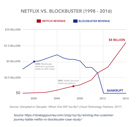
We talk more about piecewise functions now since disruptive innovations and wildcard events tend to completely change the behavior of a graph. For example, take a look at Netflix vs. Blockbuster. Did you know that Blockbuster once looked at buying Netflix and then rejected the idea? We now talk about the “whys” of graphs as well as the data.
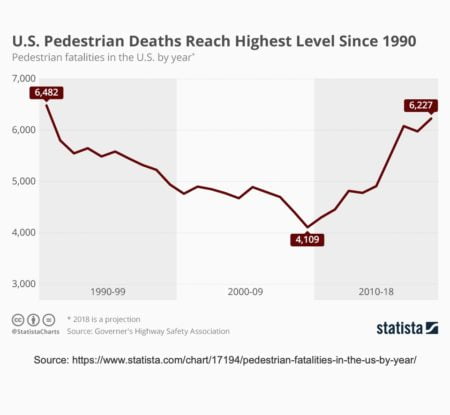
One of the most popular discussion graphs in the last year has been the graph of U.S. Pedestrian Deaths. There are so many theories that readers and students proposed for the sudden change in the graph. And the point is not that there is a right or wrong answer, the point is that there are many many factors that influence these numbers.
Many students and mathematics outsiders follow the collection now, and I want to prompt them to become curious enough to think about the “whys” of each graph and do a little outside reading and research. Thus, when I share a graph on GraphsInTheWorld, I typically include a question to get this thinking process started.
GraphsInTheWorld has taught me many random things about the world. I am like a trend encyclopedia now. In arguments, I am now infamous for saying “Actually, I don’t think that’s correct … let me show you a graph.”
And the thing that makes me happiest about this project? I still see students from past courses commenting on the current graphs. They are still learning and still engaging with math in the real world, long after the class has ended.

